6 Proven Nonprofit Email Call-to-Actions That Increase Donations

Nonprofits send countless emails to subscribers, donors, prospects, and supporters. Most of these emails tell compelling stories, give updates, share images, or describe the outcomes of successful fundraising ideas and events.
However, when it comes to encouraging readers to take action, such as clicking a link, reading a blog, getting more information, or, most importantly, supporting your mission, you need to include Call-to-Actions (CTAs) in your nonprofit communications.
According to WordStream, emails with a single CTA increased clicks by 371% and sales by 1617%. CTA, in your nonprofit email communications, is essential to spurring recipients to take action. It can play a significant role in encouraging them to move down your donor funnel. You must, therefore, put your best foot forward in creating the perfect CTA that brings the desired results.
This article explores six nonprofit email call-to-action that can increase your conversion rates and contribute to boosting your fundraising outcomes.
Track Your Nonprofit Email Metrics Using Keela
See how nonprofits use Keela’s email marketing tools to create, send, track, and measure the success of their email marketing campaigns.
1. The Urgency Demanding CTA
This is a tried and tested sales technique that also works when you’re not selling anything, like nonprofit digital marketing or email marketing endeavor. People are more likely to act when they believe they have a limited amount of time to achieve something.
Creating a sense of urgency about your cause is a big aspect of any CTA. Make your email recipients feel as if waiting isn’t an option and that they must act right away—it’s now or never.
You may build urgency by using impactful terms like “now”, “last day”, “hurry up!” or “today,” but you should also think creatively about how you might motivate your visitors to take prompt action. For example, something like this: “Donate now to see us at the top spot before midnight.”
You could also persuade people to support your cause as soon as possible, which you could achieve with an alarming statistic or a compelling image. The following is an example:
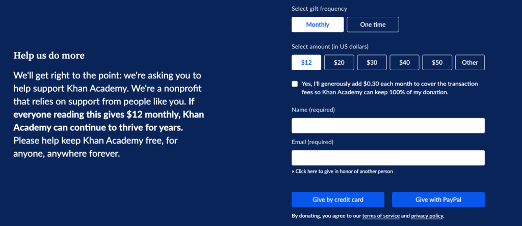
When consumers visit Khan Academy, they will see this pop-up. The entire pop-up is quite clear, with a donation amount starting at $12, various payment methods, a sense of urgency, and a strong emotional plea to the readers.
2. The Impactful CTA
The success of your nonprofit’s CTA is highly dependent on the consistent usage of strong verbs and commands. Another way to be explicit about what you want others to accomplish is to use this method.
While it’s courteous to inquire, your CTA isn’t the place to say “please.” “Please donate to help the environment today” would seldom appeal to your nonprofit-targeted email list to actually donate, even if they might be having an environmentally friendly disposition. On the other hand, “Donate to the environmental fund now!” is much more powerful and impactful in making your audience assent.
Always avoid using the passive voice and instead employ active verbs that encourage your visitors to take action. According to a study by Campaign Monitor, changing the CTA from ‘start your free trial’ to ‘start my free trial’ increased clicks by 90%.
Because there are so many possible slogans for nonprofit websites, make sure to brainstorm a few before choosing one. When in doubt, go with the most attention-getting sentence you can think of. With verbs such as “Act,” “Donate,” “Register,” “Transform,” “End,” and “Contact,” your readers have a clear-cut idea of what will happen when they click on the CTA links or buttons.
3. The Concise CTA
No matter what, your CTA must have only a few words. It should be as brief as possible but clear and to the point. If you need to provide more explanation, do so before or after the CTA, but keep the actual CTA button to a few words only.
There is a simple test called WYLT-IWLT to make sure whether your CTA makes sense to your recipients. In the following structure, fill the gap with your CTA text:
Would you like to _______?
I would like to _______.
This test helps you to see if your CTA button makes sense from both the receiver’s and the sender’s perspectives. It’s the Internet’s standard structure for CTA buttons, and we’ve found that running this test helps us narrow down our CTA phrases to the most important keywords for the email recipient’s understanding.
To complement your CTA and to make it more concise, consider adding a simple graphic element. People scan images faster than text, so incorporating visually appealing images with your CTA may have a bigger impact than just text.
There is also an emotional angle associated with every color used in your CTA, which can inspire a particular action from the email recipient. We’ll discuss this emotional aspect in detail in our preceding section on Emotional CTA.

Ready to Transform Your Email Marketing Strategy?
You can use this free guide to learn more about key email marketing metrics and how they work together to help you craft meaningful, engaging nonprofit newsletters.
4. The Pragmatic CTA
Having created the urgency with the CTA, along with the impact of strong verbs and commands used in a concise manner, your nonprofit email marketing can still be rendered useless if your CTAs are not practical. For instance, seeking donations through your CTA when your email body is emphasizing more on recruiting volunteers will not have a good outcome; in fact, no outcome for that matter.
It’s, therefore, very important to decide beforehand what you want your readers to do. Subscribe or share? Like on social media, donate, or sign up to volunteer? With the right choice offered by you, your target audience would also make sense of what exactly is the proposition you’ve placed before them to act upon.
Another example of a pragmatic CTA is, say; you’re organizing a cycling marathon, a CTA like “Join the Cyclothon” or “Participate in the Cycling Marathon”, although acceptable, will not be as impactful as “Get, Set, Go” or “Ride to Change Lives” or “Ride for a Good Cause.” The latter three CTAs are not only ingenious but also related to the event and thus practical.
5. The Emotional CTA
Another tried and tested method of persuading individuals to act is to appeal to their emotions. As a nonprofit, you almost certainly have a ready-made emotional appeal since you’re far away from conversions and revenue and closer to social and environmental causes. Most people are all ears to listen and all arms to embrace the causes that are making the world a better place.
Here are some instances of CTAs that go beyond the ask and address your reader directly:
- “Donate to feed a child”
- “Join in to save the trees”
- “Pledge towards a Green Future”
- “Support a Child This Winter”
Directly appealing to people’s emotions is an effective technique to encourage them to act.
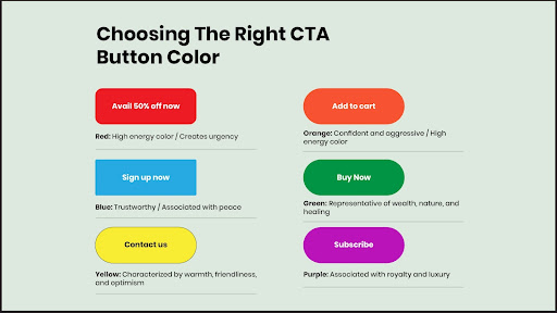
The color of the CTA button also has an emotional significance and, therefore, must be noticeable and stand out.
Since one cannot deny that colors ignite emotions, it’s a good idea to use various colors for nonprofit email CTAs. Colors like red, dark blue, orange, purple, etc., are high-energy colors. The following image depicts the personality traits of various colors:
6. The Creative CTA
CTAs play a vital role in emails, especially in nonprofit emails. That doesn’t mean it has to be dull or tedious. An ingenious CTA can be highly engaging and can inspire your email audience to act as you want them to.
It is, however, important to take care and not fly so much in the creative air that you make your CTA absolutely obscure or meaningless altogether. Just make sure you’re still clear on what you want them to do. Avoid using flowery words or metaphors that may be misinterpreted or not be interpreted at all.
As an example, consider there’s an initiative to plant trees in the technology park that your company is a part of among several other companies. And you’re responsible for writing a nonprofit email to each and every individual working in the various companies of the tech park.
For the CTA, you have two options:
- “Help the Park Go Green this Friday”
- “Sign Up & Spend the Friday to Make Our Park Green”
Both CTAs are worded creatively. In the first CTA text, however, it isn’t clear what you’re seeking. Participation or donation? Or something else?
The second CTA clearly signifies it’s seeking volunteers for the Friday initiative.
Thus, it’s good to be creative but equally important to be clear.

Discover 15 Ways to Grow Your Nonprofit Email List
Learn the tips that can help you attract more subscribers to your nonprofit’s newsletters and boost the success of your fundraising appeals.
It is important to note that CTAs have an identity of their own and work best when they’re stand-alone. Designing CTAs for nonprofit emails is not as easy as one may think. Because here, selling, conversions, and revenue are not the driving factors. You have to inspire your email recipients by expressing them in a clear-cut manner, what exactly you’re seeking. A poorly drafted CTA can render all the other five or six email elements useless. You must, therefore, be very careful while devising the CTA for nonprofits.
A uniform set of CTAs working for all kinds of nonprofit organizations (NPOs) is nearly impossible to devise. To make the CTAs stand out, each NPO must use different strategies. By following the suggestions and CTA examples in this post, we hope you’ll design a successful nonprofit email CTA that’ll work wonders for you.