19 Easy Ways to Optimize Donation Forms for Nonprofits

No matter how you fundraise online, whether you're bulking up on Facebook followers, launching massive explosions of emails, or promoting peer-to-peer campaigns until there aren’t any more peers to reach, your potential donors are likely to end up at the same place: your donation form.
If you’re like many nonprofit organizations, there’s a solid chance you haven’t thought that hard about it. A few required fields, enter your donation amount, bada bing, fundraising magic, right? Not exactly. Ever stop to think about how many people made it to the form and didn’t click DONATE?
Your organization and the people who benefit from the hard work you put into pursuing your mission could be missing out on a significant stack of essential revenue. So what should you do about it? Thankfully, that’s an easy question to answer, and it’s even easier to torque your nonprofit donation form into a lean, mean donation-gathering machine.
What is a Donation Form?
On the surface, an online donation form may appear to be just that: a form hosted on a page of your website, where donors enter the required information so that they can give to your cause. It connects to a payment processor so that donations can move efficiently from your supporters’ credit cards to your organization’s bank account.
But there is an underlying purpose to your donation form as well. And that’s data.
Nearly two-thirds of donors in Canada and the U.S. prefer to give online. That’s a huge cross-section of the population that may be heading to your form sometime soon. In addition to their donations, your form can help you capture valuable information about your donors for inclusion in your donor management strategy. If you’re using a quality CRM like Keela, you can automate the data collection process.
By aggregating data from your form, you’ll be better equipped to engage with donors, build lasting relationships, and ultimately raise more money. But your form has to do the primary job of processing donations to achieve the secondary goal of collecting that delicious data. It’s not a small task: donation conversion rates aren’t particularly encouraging. So, you better ensure your donation form is as good as it can be.

Tips for Boosting Conversions on Your Nonprofit's Donation Form
Fortunately, you can make lots of easy changes to your donation form that will help max out your donor potential. Here are 12 tips to boost your conversions on your donation form, followed by eight more best practices that focus on your donation form’s design.
1. Keep it Short and Simple
Details are best kept elsewhere; keep that donation form streamlined. It should be easy to read and, maybe more importantly, easy to understand. Use basic language to keep people from getting confused and leaving before they donate.
2. Optimize for Mobile Devices
It’s easy to get a form to look good and function well on a desktop computer or laptop. Smartphones, on the other hand, can be a challenge. But a quarter of donors give on mobile devices, so you have to be sure your form works even on small screens.
If someone has pulled out their phone and made it to your donation form, chances are they are primed to give. But if they have to wait until they get home to a laptop, you’re running a solid risk that they’ll forget, or worse, get frustrated and give up.
Many popular website-building tools automatically optimize for mobile devices, but it’s still a good idea to test your form to display it correctly.
3. Limit Distractions
A donation form is not the place for a long pitch about why donors should give. You did that already; that’s what got them to the form in the first place. Focus on building a form that gets supporters to fill out details and click DONATE instead of giving them many distracting texts to read. Only include information that is necessary to get them through the donation process.
4. Make it Compelling
The call to action (CTA) on your donation form must be compelling. So while you want people to submit their information, putting SUBMIT on the form button is a little bit drab. Try something punchier, like one of these awesome CTAs. The goal is to clarify what will happen when users click the donation button and inspire them to click it.
Side note: put your CTA button near the bottom of the form, since that’s the last thing they’ll do, and make it obvious by using high-contrast colors and a size that sets it apart from the rest of the form.
5. Enable Recurring Donations
Generally speaking, recurring donors are worth much more than one-time donors. Even small donations add up to a sizable contribution to your mission over a long enough period. So it makes sense to prioritize recurring gifts from the first time someone hits your donation form.
Add a recurring option to your donation form to allow donors to commit to long-term support while it’s at the top of their minds. Keela’s donation form tool makes this process super easy. And if you’re worried that it will put donors off, stop worrying: more than half of respondents to this survey are enrolled in a recurring giving program.

6. Suggest Donation Amounts
Rather than giving donors a blank field for the donation amount and hoping for the best, it’s a good idea to include suggested donation amounts on your form. This can help donors who hesitate to give because they aren’t sure if their small donation will make a difference. It may also push some donors to give a little more than they had initially intended, especially if you follow these tips.
It’s also a great way to encourage donors to give in a range that will allow you to achieve your business goals. And don’t forget to include an “amount of your choice” field, just in case you encounter that one-in-a-lifetime mystery philanthropist in a good mood. Keela’s forms tool makes this process a snap.
7. Reduce Forms Fields
Even though you want to gather data from your donation form, asking for too much information and using too many form fields may cause some donors to drop out before they can complete their transactions. Limit the number of fields to important data points like names, contact details, billing information, and anything else that is essential to your campaign. If anything is missing afterward, you can look up the donor’s details with a people search tool.
8. Use Secure Payment Processors
When spending money on the internet, the most important thing people need to feel is trust. This goes for donations, too. So use a secure, recognizable payment processor like PayPal or Stripe on your donation form and let potential donors know a trustworthy service is handling their donation.
9. Commit to Protecting Donor Data
Security-conscious donors may be reticent to share their information if your donation form does not appear to be 100% secure. Take these steps to assure donors that their data is being protected:
- Add your charitable registration number to the bottom of your form
- Include a link to your privacy policy
- Embed your donation form into your website
- Make sure the form webpage is TSL/SSL secured
Other actions you can take to protect your donor data include using a DMARC lookup to handle unauthorized email usage on your domain’s behalf.
10. Confirm Donations
The first thing many donors want to see after they click DONATE is a screen confirming their donation and thanking them. The second thing they want to see is a new email in their inbox. These confirmations are yet another way to build trust with donors; not only do they indicate that the transaction was completed correctly, but they also confirm that the donation went to the right place.
With Keela donation forms, you can easily direct donors to a confirmation thank you page and automatically send them a customizable thank you email that includes a tax receipt. Conveniently, donors who complete donations have automatically opted into your email communication contact list, which means you can start priming them for their next donation using an email drip campaign.
11. Optimize Your Donation Page
Sometimes, low conversion rates have less to do with your donation form and more to do with the page it is on, that is, the donation page. You can do lots of things to optimize your donation page, like moving your form closer to the top, eliminating distracting elements, or putting more effort into SEO. For a push in the right direction, check out these examples.
Best Practices for Designing Your Donation Form
12. Use One Column
When it comes to filling out forms, people tend to think vertically. After individuals complete one field, they logically look beneath that field. To meet that expectation, build your forms with fields that run from top to bottom. This will help your audience and guide them to the bottom without missing any fields.

13. Divide Fields into Categories
Splitting your form fields into separate, related categories helps donors stay organized as they fill in your donation form. For example, try to separate contact information from payment information.

14. Avoid Dropdown Menus
Fewer clicks are always better. In this sense, dropdown menus with only a small number of options are better redesigned as radio buttons or checkboxes that show all available options without having to click. Save dropdowns for long lists of options that just won’t fit anywhere else.

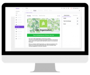
15. Brand Your Form
Customize your donation form with your nonprofit’s brand, including a color scheme and logo. Branding helps to build confidence that the donation form is legitimate and reinforces the connection between the donor, their wallets, and your organization.
16. Add Hints Below the Fields
To help donors avoid making mistakes that could jeopardize the completion of their transaction, add hints below fields that need explanation. For instance, if your form requires a phone number, add a hint that shows the correct format.

17. Spread Out Long Forms
If you have an unavoidably long donation form, consider spacing it out over two or more form pages. Long forms can be overwhelming and encourage donors to give up. Instead, ask for contact information on the first page of the form, followed by payment information, etc.
18. Design Accessible Donation Forms
Accessible design is a constantly evolving, extremely specialized field. But there are plenty of simple design choices you can make that will help more people fill out your form and make a donation:
- Make your text highly visible
- Keep labels short
- Specify required fields
- Use high-contrast colors that work for the colorblind
If you want more, check out these 10 foundational rules for accessible design.
19. Test Your Donation Form
No matter how precise you think you’ve been when building your form, there may be some small problems that slip through the cracks. This is why you need to test your form. Fill it out yourself and make sure everything works properly, makes sense, and is easy to use. Then pass it along to a teammate or someone you trust and have them do the same.
It’s also a good idea to track your donation page conversion rate after you’ve made changes so you can see if they’re working. And if you want to get experimental, try running some A/B tests with different designs, different CTAs, or different suggested donation amounts.
Thrive in Evolving Landscape of the Nonprofit Sector with the Help of Keela!
See how Keela’s suite of intelligent tools are designed to address the ever-changing and diverse needs of the nonprofit sector.
Sample Donation Forms
Now that you’ve taken a crash course in creating superb donation forms, let’s take a look at two examples to wake up the creative side of your brain.
For example, in this donation form, notice how the Vancouver Metropolitan Orchestra customized its form to match its branding and broke it down into multiple steps. They also suggested donation amounts and offered a recurring donation option.

And in this one from Backpack Buddies, they did everything noted in this first example and specifically added PayPal by name as a payment option to boost credibility.

Create Unlimited High-Converting Donation Forms with Keela
The easiest way to get moving on your brand new, super-converting donation form is to build it using Keela’s form tool. It will help you customize your form with your brand, donation amounts, and data points; you name it, and Keela does it. And the best part is that when donors fill out your form, the information goes directly into your Keela CRM automatically, so you can manage your donors, collect more donations, and do more good in the future.