Data Visualization for Nonprofits: How to Tell Data-Driven Stories
We’re living in a data-driven world. You might be wondering what this means for storytelling. We’re here to help.
There is always a great story behind every image, mission statement, staff photo - and data point. From our experience, we have found that readers respond best to emotion-evoking content rooted in empathy and impact.
Mediums such as photos and videos are traditionally used to create this connection, but when approached the right way, we think data can truly strengthen stories from nonprofit organizations.
In this article, we’ll cover the origin of data visualization, why it matters in the world of Big Data, and the most common visualization tools. By the time you finish reading this, you'll know how to apply best practices in design to your data-rich stories.
Are you ready to jump on board with data visualization for nonprofits? Read on.
Big Data and Data Visualization for Nonprofits
Big Data
Big Data refers to data sets that are generally too large and complex to analyze with traditional tools like excel. This matters because, from raw data, companies and organizations can seek out insights that catalyze growth and influence marketing and development decisions. For example, Keela's DonorSearch Integration can give your wealth screening insights that'll help you find more major donors and optimize your fundraising efforts. The processes of data collection, storing, and analysis can be broken down into three core elements:
- Volume: An organization's capacity to collect large amounts of data. With the rise of storing solutions, it is getting easier and cheaper to collect sizable datasets.
- Velocity: The speed at which organizations collect data. The Internet of Things (think smartwatches and vehicle sensors) revolutionized the demand for data analysis tools.
- Variety: Data exists in a range of formats from traditional numeric metrics to less structured mediums such as text, video, and images.
Now that we’ve covered the what and how of Big Data, let’s talk about how we visualize data. Data-driven insights become powerful only once they are digestible and actionable. This next section will come in handy when it comes time to share your organization's impact.
Data Visualization
In the nonprofit industry, it is vital to pair analytical information with visual strategies to appeal to a reader's logos (logic) and pathos (emotion). For example, color treatments, animation, and fonts influence the way someone feels and connects with your data points. Simply put, storytelling and data meet in the context of data visualization.
Here's how Tableau, a data visualization company, defines data visualization:
Data Visualization is the graphical representation of information and data. By using visual elements like charts, graphs, and maps, data visualization tools provide an accessible way to see and understand trends, outliers, and patterns in data.
In layman's terms, this means data visualization can range from simple tools like bar graphs or pie charts to complex arrangements like heat maps and multi-layered word clouds.
The how and why behind data visualization can be summed up with five core points:
- Context. Understanding context helps lay out the visual format. Begin by asking yourself the following questions: What is the context of the data? Is it fundraising dollars? Programming metrics? New hires?
- Visualization. You’ll want to consider how much data you are presenting. Single points like total dollars raised will use a different tool than a breakdown of donors. With a single number, we recommend using animation or an accent color to emphasize the point. When visualizing something like a breakdown of funding sources, consider using color variety to help the reader distinguish between the range of information displayed in the tool.
- White Space. Data can be overwhelming and cluttered. Be sure to give your data visualization tools white space to allow your information to breathe. This will, in turn, ensure that the most important information stands out.
- Focus. Keep your reader focused with succinct titles, highlighted points, and simple explanations.
- Storytelling. Data visualization came from the idea that data is a great storytelling tool. Try placing your visualization tool on a blank slide. If you can tell a story from start to finish by just referencing a single visualization, you’ve done a great job!
There are no rules to storytelling or data visualization. Rather, these tips should serve as a starting point. If you feel ready to get started, read on to discover the most commonly used visualizations. Spoiler alert, you’ve likely heard of a few of these already.
The Most Common Data Visualization Tools
There is no shortage of great visualization tools, some more specific than others. We’ll cover the four most common types below.
- Dashboards
- Charts and Graphs
- Tables
- Maps
1. Dashboards
Dashboards for nonprofits are great for emphasizing key growth or success metrics across fundraising, marketing, and programming. While you can’t write an entire report in a bright, bold red font, it’s a great way to highlight a couple of insights.

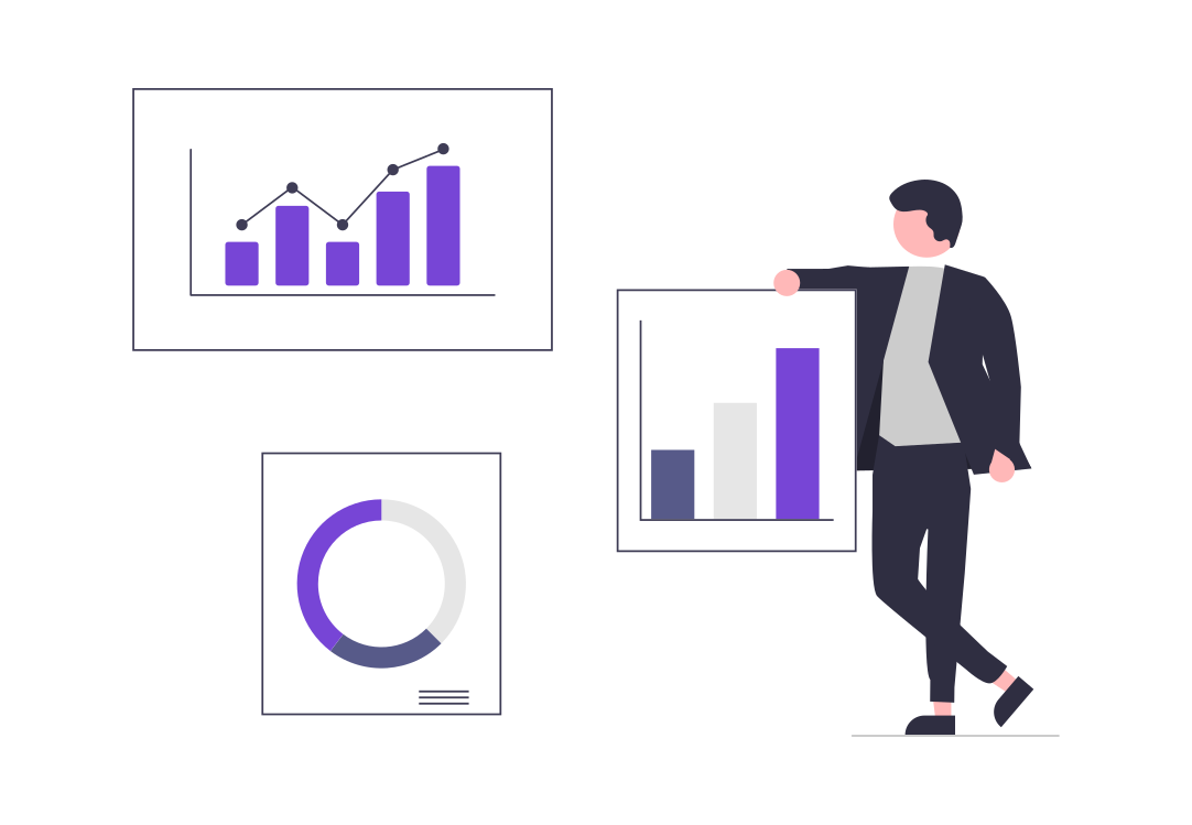
2. Charts and Graphs
There are about 15 different types of graphs and charts you can use in data visualization. We recommend pairing something like a financial statement with either a graph or chart to provide the reader with a layer of analysis.

3. Tables
Tables are a classic tool for expressing a range of numeric values in a way that makes it easy for readers to understand insights and see patterns. As seen below, Operation Lifesaver went a step further by comparing their 2017 and 2018 statistics across two different metrics.

4. Maps
Maps have a language of their own and for a long time spoke in a static manner. In the digital age, you can create maps that evolve in real-time to reflect growth, outreach, and impact. Check out these 10 examples of ways you can use maps to visualize data.

Big Data is constantly evolving. The industry is ripe with company blogs, independent bloggers, and academic researchers commenting on and revealing discoveries from the field. To stay up-to-date, we recommend checking out this guide.
Our platform Yearly was designed with story-telling top of mind. Are you in the process of telling a great story? Try Yearly today for free, forever.
Designing and building your report is just the beginning of telling your story.